The temps this summer are up and its been absolutely beautiful here in Coeur d’Alene, ID – I’m daydreaming out my office window looking at the lake and can’t stop dreaming about… Snow!
I wanted to take a moment today to talk about branding. It’s one of my favorite things to create and yet it’s one of the services that I offer that has left me the most conflicted about design and clients.
So many times I become the tool for my clients, and get forced into doing things that I may not absolutely agree with. I’m not the kind of designer that’s going to shove concepts down your throat and sell you a song and dance about why your branding must be a certain way. That’s not to say that I won’t give you my opinion, and I will most certainly try to listen to your input regarding your brand, but at the end of the day it’s your business, and I can only lead the horse to the water, I can’t always make it drink…
Working with business owners as clients has taught me many things, but the most important is that sometimes you just have to be patient. This story gives me so much satisfaction, that what I’m saying holds true.
Snowbiking! I started riding snowbikes in 2008. It’s the funnest thing I’ve done in my adult life because it joins my 2 favorite hobbies of snowboarding and dirtbike riding into, well… the most fun I’ve had in my adult life! I first met Allen Mangum in 2009 and was able to witness his creation of the Timbersled Mtn. Horse. Timbersled products (located in Sanpoint, ID) was a pioneer in snowmobile modifications at the time. Allen was not only the owner of the company, but he was also the mad scientist / accomplished engineer that developed their products.
You can imagine how excited I was to help him when I was given the chance to “design” some of his initial graphics…. Right from the beginning I knew it wasn’t going to be easy…
Timbersled was well established with it’s current clients… They were revered in their industry for aftermarket parts and custom tuning on mountain sleds. They already had an established look, and even though I understood the motorcycle and snowboard cultures, I wasn’t a snowmobile person, and I didn’t get very far with my opinions. They didn’t really put much worth on the value of good branding, they had some local sign shop work they had been using for Timbersled Products. The task at hand quickly became to re-create a sketch concept from a family member and join it with their current parts to create a new logo for their latest invention. I offered some suggestions, but all of my ideas were thrown out, and I became the “graphic artist” that put the parts together for the first Tibersled Mountain Horse logo. And that’s completely fine… I was happy to be involved and I still wanted to be part of the snowbike culture…
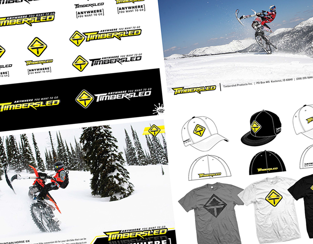
 The Timbersled shaped the foundation of todays modern snowbikes and back then it wasn’t much of an argument about who’s product was the best since the first Timbersled hit the market (depending on who you talk to). The opportunity to get the “Branding” discussion back on the table came my way again in 2014… They realized that their typeface could probably use some work, and that they really didn’t have a brand that matched the culture of their new customers. So they were open to change, BUT… They really wanted to keep the same colors, the tree and the mountains… ugh… Sometimes people get hung up on things that they feel are important to tell the story, but in the case of good solid brands it’s all about simplicity. Here’s some ideas that I put together back in 2014 to try and steer them away from those predetermined criteria…

Sadly… Once again I didn’t win the argument, and this was the new released logo and Icon… I was happy that we were able to give the typeface an update, but I was really hoping to finally streamline the branding to something that could get the culture of snowbikers more excited about the brand.

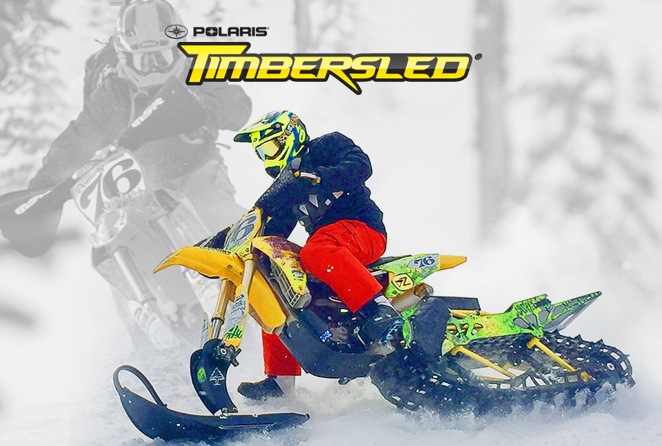
In April 2015 Polaris Industries, announced the acquisition of Timbersled. I was nervous that my involvement with the brand would come to end… After all, I’m just a small designer from N. Idaho, and they have teams and agencies that develop most of their materials. But people started reacting to the simplified new type face, and the idea of a Timbersled snowbike silhouette started to become a more iconic image rather then the trees and mountains… So these marks became the new branding for the majority of the 2016-17 product years. It was finally starting to work…
Today the branding has finally been refined down to these simplified versions. Not far from my initial concepts and suggestions…
Being a graphic designer isn’t always easy, and sometimes the client may push you in a direction you don’t want to go. However, Solving the clients problem at the time, and letting them develop their brand on their own terms is just as well. I’ve been working on/with this client for almost 10 years! My passion for the sport and confidence in their product has kept me inspired to stay involved and now I can finally say.. Yeah! I did that! 
